A New Nutrition Facts Label That Even Your Kids Can Understand
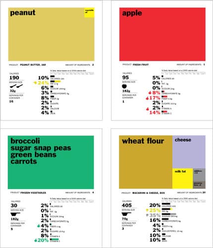 Nutrition and food ingredients are often criticized for not being accessible enough to the masses. With packaging and commercials using ambiguous terms like “healthy” and “natural,” it’s not surprising that many people, even parents, don’t take a closer look at what exactly is in their food. But University of California, Berkeley, School of Journalism has taken it upon themselves to redesign our nation’s food label to make understanding ingredients easier. Students generated many ideas, of which the winner (featured here) was announced this week. The designs by students are reported to be considered by the Food and Drug Administration for an official redesign.
The contest at UC Berkeley featured many notable judges including Michael Pollan, author of The Omnivore’s Dilemma. The food writer had this to say about the winning entry:
”Walker’s design is dramatic, intriguing and holds great promise,’’ said Mr. Pollan. ”I liked being able to see the visual breakdown of foods, although I wonder how her design would work with more complicated products, like Lucky Charms, say, or a PowerBar. Even so, it’s a step in the right direction. What I’d like to see next is some sort of color coding for the food groups and some attempt to show the degree of processing of various foods. Eating doesn’t have to be complicated; figuring out what’s in your food shouldn’t be either.”
Another noteworthy point about a “Nutrition Facts” label like this one is that it makes nutrition more comprehensible to children. Just as our food pyramid has undergone a redesign thanks to Michelle Obama‘s initiative, nutrition labels too perhaps warrant some updating. Children should be invited into understanding nutrition in a way that actually gives them some insight into what they’re consuming as opposed to simply doing what their parents tell them to.
(photo: nytimes.com)